
Overview: The Problem Space
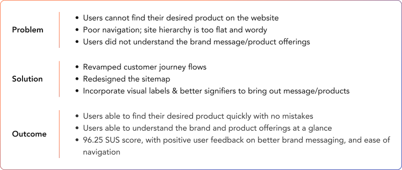
How much does a mistranslated brand message & poor site navigation
impact a user’s experience, and subsequently, the business?
impact a user’s experience, and subsequently, the business?
Today, a strong digital presence is essential in building a loyal customer base. A digital site needs to convey who the brand is without the need for a face-to-face interaction.
At her core, YTL is an online store. Majority of customer traffic and sales transactions seem to be made online, which only makes having a good user experience on their website a number 1 priority. Yet, users struggle to understand their digital brand and search for products on the site. This can harm sales conversion, which is suboptimal for YTL.
At her core, YTL is an online store. Majority of customer traffic and sales transactions seem to be made online, which only makes having a good user experience on their website a number 1 priority. Yet, users struggle to understand their digital brand and search for products on the site. This can harm sales conversion, which is suboptimal for YTL.
UX Design Strategy
Getting to know: Ying The Label
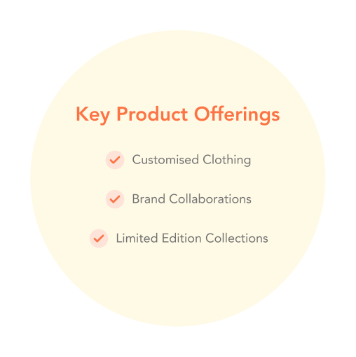
From my market research, I found that YTL’s customers are generally women looking for meaningful and conversational clothing. These users prize the meaning behind the art more than the clothing itself.
The price of a dress is not the key decision making factor
for these users. The story is.
for these users. The story is.
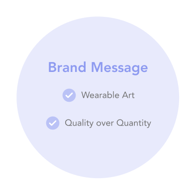
In-Depth Conversations with Customers
User Interview & Usability Test
I started my interview by asking users about their first impressions. Users were then tasked to find a product to cart out, and customise a dress. As suspected, all users were unsure of the product offerings and the brand message based on the home page of the website. There was also a high failure rate during the usability test. At the end of the usability test, I carried out a short user interview to understand the behavior, habits, perceptions of the brand and experience from the user’s perspectives.
For a designer label, messaging needs to be delivered to their customers on their landing page.
Key Observations & Insights
Synthesizing my research using an affinity map helps me to extract the key insights and observations.
I found that there are 3 major pain points in the site’s usability that were similar across all 5 users. During the usability test, the reasons the users failed to carry out the tasks were mainly due to these pain points as well.
1. Unclear Primary Navigation
- Lack of visual hierarchy and priority
- Users are overwhelmed by long lists
- Lack of visual hierarchy and priority
- Users are overwhelmed by long lists
2. Confusing Labels & Content Structure
- Users interpret the content of the pages wrongly
- Navigation structured incorrectly, confusing users
- Users interpret the content of the pages wrongly
- Navigation structured incorrectly, confusing users
3. Wordy & Redundant Pages
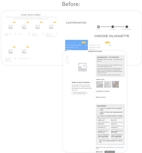
- All users did not know how customisation works with no visuals and decided to book an appointment instead
- All users believed that a luxury customisation process should be done in-person
- All users did not know how customisation works with no visuals and decided to book an appointment instead
- All users believed that a luxury customisation process should be done in-person
In general, the hypothesis made at the beginning of the research was proved: customers struggle to understand the brand and search for products on the site.
Problem Statement
Users cannot find their desired product on YTL at a glance
because the site is too wordy & navigation is unclear.
because the site is too wordy & navigation is unclear.
How Might We
present information in a clear and visual manner
so that users can understand the brand and product at a glance?
so that users can understand the brand and product at a glance?
Navigation Redesigned
A smooth navigation is required to offer a nice user experience. The site’s present flow had some major flaws. As a result of the data I collected, I overhauled the site’s user flow, fixing the current issue via 2 research methods - looking at best practices from other online experiences and a closed card sorting.
1. Learnings from best practices (for product discovery & customisation)
(A) Product Discovery via visual labels
(B) Top customisable experiences are mainly offline
2. Closed Card Sorting
I used this technique to determine if the labels of the primary navigation should stay, be changed, or eliminated based on how users current mental model on typical navigation labels and how much they perceive its value for YTL.
Proposed Site Navigation
Having analysed all the info from the research I got from the previous stages, the optimal site architecture was designed.
- Adding Visual Labels
- Customisation renamed as Bespoke
- Bespoke Page is a priority and is brought nearer to the left
- Stories behind collections & collaborations parked under Editorial
- Adding Visual Labels
- Customisation renamed as Bespoke
- Bespoke Page is a priority and is brought nearer to the left
- Stories behind collections & collaborations parked under Editorial
Design Inspiration
& Building the Prototype
& Building the Prototype
Moodboard & Styles
YTL’s current design style uses plenty of vibrant watercolours. She focus on clean and simple silhouettes. To ensure that the brand integrity of YTL was kept in the redesign. I created a moodboard based on overall brand, vibe, and colours.
Inspired by Glass
I love the sheen of light bouncing off glass surfaces. It gives a highly minimalistic and luxurious feel to any living space. I explored to see how a glass hover effect could elevate a user’s digital experience.
Ying The Label Reimagined
BY ESTHER ONG
Usability Tests & Insights
In my redesign, I provided a new foundation and a fresh look for YTL’s customers. The next step in my design process is to test it out on actual users.
Research Goals
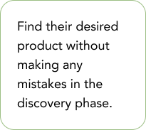
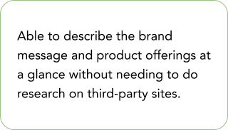
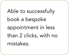
The Results
The branding and product offerings of YTL received very positive feedback from 4 customers of YTL.
1. Visual Primary Navigation
- All users loved the redesigned primary navigation
- Easier to find products with visual collection labels
- Added to the branding of YTL
- 1 of 4 users recognised the print for ‘Explore More’ and almost thought it was the collection
- Easier to find products with visual collection labels
- Added to the branding of YTL
- 1 of 4 users recognised the print for ‘Explore More’ and almost thought it was the collection


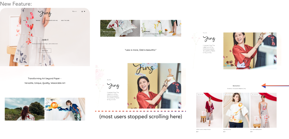
2. Bestsellers
- 3 of 4 users (almost) missed the bestsellers on homepage as it was too far down
- Lack of affordance to tell users to continue scrolling, most users stopped after they see Ying’s picture.
- Lack of affordance to tell users to continue scrolling, most users stopped after they see Ying’s picture.

3. Redesigned Bespoke Page
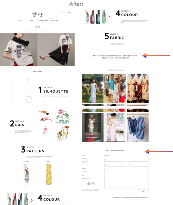
- All users loved the fresh look and the visuals helped them understand how the customisation works
- 3 of 4 users felt the instruction to book online was not clear from the top of the page
- Users had to scroll long before reaching the booking form
- 3 of 4 users felt the instruction to book online was not clear from the top of the page
- Users had to scroll long before reaching the booking form

Future Roadmap
The redesigned website was very well received by users as it was able to
1. Improve the online shopping experience for users
2. Translate the brand message of YTL accurately
Moving forward, I will work on an iteration of the current design and add more pages to the prototype before testing it with a new set of users again. In addition, I would like to recruit more users from Customer Segment 2 (Women Late 30s to 50s). From my initial findings, they way they perceive branding and online experiences is a little different from Customer Segment 1. Nonetheless, the patterns and designs created would later help inform future parts of the site so as to constantly improve the online shopping experience for YTL’s customers.
Key Learnings
Importance of a larger sample size in research
During my card sorting test, 5 of 5 users could understand what ‘Editorial’ means and the kind of content they will be able to find under this header. However, in my usability test, 0 of 4 users were able to understand what ‘Editorial’ means. All users expected it to have content similar to that found under ‘Press’ and felt confused. While 5 is the magic number for a sample size in usability testing, I would like to continue testing with a larger sample size to see which word is the right one to use for the primary navigation. It seems that there were a few parts of my findings that were inconclusive due to a limited sample size of 5 users.
Importance of affordance
In my redesign of YTL, I included plenty of white spaces to elevate the minimalistic and expensive look-and-feel of the brand. However, and many of the pages lacked affordance due to the white spaces. It was not clear to users to scroll down as they were not sure how long the pages were. I learnt that UX Design is not only about making things look good, but most importantly, the design has to communicate the type of actions that users can take on the website.
Managing Perfectionism
As this was only my second project as a UX/UI Designer, balancing the nuances between ambition, perfectionism, and constraints were a little more challenging than usual. Nonetheless, I learnt how to manage my time and prioritise features and pages to build and push other features to the next iteration.
Overall the whole process was very enjoyable for me. I could not do some in person research and tests that I wanted to do due to lack of resources and limitations in time. I look forward to expanding this project further, and potentially working with a team.
Overall the whole process was very enjoyable for me. I could not do some in person research and tests that I wanted to do due to lack of resources and limitations in time. I look forward to expanding this project further, and potentially working with a team.
Thank you for taking time to read this! 😊
I am open to UX/UI design projects.
Hit me up at estherong0105@gmail.com
Hit me up at estherong0105@gmail.com
